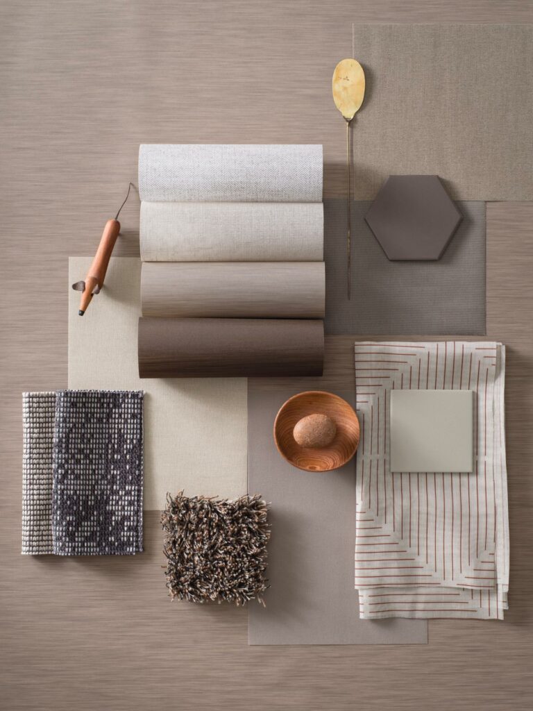
It is no news how interior design affects us, from feeling safe or boosting energy to how we want our brand to be perceived. Studio Almedahls has since the 50’s been a cornerstone of Almedahls creating both timeless and contemporary designs of colours and patterns. Today we have taken the step further and have a more comprehensive view of interior architecture to support you in creating; A better place to be.

To us at Almedahls it is equally important to consider design expression, function, quality and sustainability when developing new textiles. We work in the Scandinavian design tradition. Clean lines, materiality, craftmanship and inspiration from nature are close to our hearts.
There is no doubt that our surroundings influence our well-being. Therefore, the visual and tactile experience is the core of Studio Almedahls developments. The versatility and flexibility of textiles constantly inspires us. The possibilities to set the tone and add dimension to a room by using textiles are endless. To define space with a rug, to divide a room with a curtain or to soften the light or create privacy by using a roller blind.
Studies show that tactile materials releases oxytocin and has a calming effect. So, when designing new textiles and expressions we always consider the tactility and texture of the surface. When looking at a texture of a material, your fingertips can remember the touch. Organic and plant- like patterns, reminiscing of a forest, a meadow, or another view of nature, has a similar effect on the human mind.
It is important to be aware of why and where you place a colour, shape or pattern. What is the purpose of this space? Organic, soft shapes and patterns have a soothing effect while a graphic and sharp design or shape, can be exciting and accelerating. Dark colours make for better possibilities to concentrate while light and white colours boost energy.
We have always valued longevity in our product development as well as in our colour selection, but we are also aiming to keep a contemporary twist. By continuously editing our colour palettes we aim to stay relevant. Our extensive colour ranges are co-ordinated to make it easy for all clients to match our textiles with contemporary architectural materials, creating a lively interior or a calm harmonious setting. Like a piece of music, it is the combination of shades that creates an atmosphere.
The Almedahls colour palette has its base in cold and warm neutrals, from crisp white to the darkest black. The inspiration comes from the natural elements, the sky and the clouds, stone, earth, wood and metals. To complement the neutral base, we seek to build a versatile and well-balanced palette of soft and gentle pastels, stimulating mid tones and some playful and energetic saturated hues.

Almedahls offers complete textile solutions for public and private spaces. We design and manufacture most of our products in Sweden as we have done for the past 178 years.